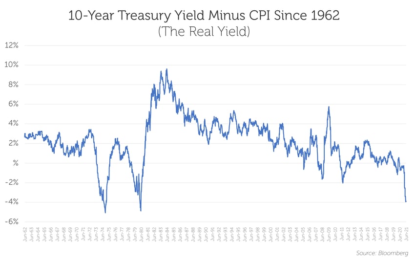
Real yields are in unfamiliar territory, and the chart below provides context for just how unusual the current environment is. It also shows that historically, such periods haven’t lasted long.
The line reflects the 10-year Treasury yield minus CPI, or real yield. Currently, real yields are not only negative, but at their lowest point since the late 1970s and early 1980s.
The story of the chart may be consistent with a consensus market view that is in line with the Fed: That inflation is transitory, and that once the sugar high of stimulus wears off, the world will revert to the slow growth, low inflation environment it has experienced since the financial crisis. As we’ve written about in prior blogs, we have a different point of view, and believe forces are in play that could encourage longer run inflation.
Another important takeaway from the chart is how fast market sentiment can reverse. In previous periods when real yields were negative, the market shifted quickly … and violently.
It remains to be seen whether we are at a similar inflection point today. But it will be interesting to see what happens if the employment picture improves quicker than expected once unemployment benefits go away and kids go back to school, and/or we see upside surprises to CPI or other inflationary signals, and/or the Fed chooses to lessen security purchases sooner than expected.
The catalyst for change is not always obvious.


